
Abstract
As the humanitarian crisis in Yemen continues, and as humanitarian funding to Yemen plummets, more and more focus must be narrowed to the people who will most benefit from the already diminishing humanitarian funding. Around 40% of the population of Yemen are in acute need of humanitarian assistance. It is very unlikely that those 40% can be reached with aid even with an optimal funding situation. Taking all that into consideration, a prioritization plan must be in place to determine who and where should be the target of humanitarian interventions. This paper attempts to put forth and analyze the prioritization method, placing more focus on the ways spatial analysis can be applied to achieve that.
Introduction
In the wake of a prolonged tragic conflict that lasted over eight years, Yemen, an already third-world country, is still one of world’s largest humanitarian crises. To scratch the surface, an estimated 17.3 million people are in need of food and agriculture assistance. About 20.3 million people are deprived of access to critical healthcare. And approximately 15.3 million people don’t have access to clean water. (OCHA, 2022b). On the other hand, humanitarian funding going into Yemen to cover some of those gaps has been in a steep decline, especially during the recent 2023 events. In fact, (Save The Children, 2023) warned that there has been major reduction (62%) in humanitarian aid reaching Yemen over the past five years, which could result in dire consequences for the most in need, especially children.
Humanitarian aid organizations, which also can be referred to as NGOs, now face a predicament before them; how do they decide who and where to target their aid with their limited funding. Humanitarian and emergency interventions should target individuals and areas in a way that ensures maximization of value for those in need while taking into consideration the minimal utilization of resources using a clear, evidence based prioritization plan. This paper aims to enhance the effectiveness and efficiency of interventions in Yemen for those who truly need them by using spatial analysis as a means to accomplish that, producing, as a result, ranking of districts in order of priority.
Methodology
In order to properly prioritize areas of intervention, the level of the desired geographic detail must be determined beforehand, taking into account the availability of data for the choice of that level of detail. Yemen’s current administrative boundaries are as follows: it is divided into 22 governorates (admin level 1), 333 districts (admin level 2), and about 534 subdistricts (admin level 3) (OCHA, 2023a). Most of the humanitarian data that exists online regarding Yemen is available at the district (admin 2) level. Therefore, the prioritization undertaken in this paper is at the district level. Below are the factors included in calculating the district priority ranking:
1- Yemen Humanitarian Needs Overview (OCHA, 2022a), specifically the file named: YEM_PIN_2023.xlsx, which describes each district along with official UN estimates and information about the people in need in total and in different sectors.
2- Yemen Hard To Reach Districts (OCHA, 2019), which outlines which districts are hard to reach and for what reason.
3- Yemen: Who Does What, Where 3W/4W (OCHA, 2023b), which shows the presence of humanitarian actors for each district. The file used here is: YEM_4W_Jan-Dec 2022.xlsx, within that, the sheet: presence per dist, and type, which contains a table that indicates NGOs presence in each districts by taking total sum of NGOs that are present for each month of the year 2022.
It is important to note that the result sought here, which is a ranked list of districts in order of priority, where the districts are ordered in an ascending order from the greatest priority to the lowest priority. This paper can be thought of as a framework to generate such a list, also allowing the reader to conduct a prioritization exercise on their own, even for another country.
Implementation
The most important variable when discussing prioritization is need. This section, therefore, will start with that. One way to show the people in acute need on a map is representing the intensity of people in acute need against the area size of each district using a dot density map. The code for generating such map is as follows:
# Load necessary libraries
library(sf)
library(readxl)
library(tidyverse)
library(ggplot2)

# Step 1: Import shapefiles
adm1_shapefile_path <- "ye_admin_shapefiles/yem_admbnda_adm1_govyem_cso_20191002.shp"
adm1_shape_data <- st_read(adm1_shapefile_path) # Reading shapefile into R

adm2_shapefile_path <- "ye_admin_shapefiles/yem_admbnda_adm2_govyem_cso_20191002.shp"
adm2_shape_data <- st_read(adm2_shapefile_path) # Reading shapefile into R

# Step 2: Import Excel table
excel_path <- "yem_pin_2023.xlsx"
excel_data <- read_excel(excel_path) # Reading Excel file into R

# Step 3: Merge shapefiles with the Excel table
merged_data <- adm2_shape_data %>%
  right_join(excel_data, by = c("ADM2_PCODE" = "#adm2 +code"))

# Number of individuals each dot represents
people_per_dot <- 1000

# Initialize a list to store points for each district
points_list <- vector("list", length = nrow(merged_data))

# Generate points for each district
for (i in 1:nrow(merged_data)) {
  # Calculate the number of dots for the district
  n_dots <- as.integer(merged_data$`#inneed +acute`[i] / people_per_dot)

  if (n_dots > 0) {
    # Sample points within the polygon
    points_list[[i]] <- st_sample(st_geometry(merged_data[i, ]), size = n_dots) %>%
      st_coordinates() %>%
      as_tibble() %>%
      rename(x = X, y = Y)
  } else {
    points_list[[i]] <- tibble(x = numeric(0), y = numeric(0))
  }
}

# Combine all points into one data frame
all_dots <- bind_rows(points_list)

# Create the dot density map
ggplot() +
  geom_sf(data = adm1_shape_data, fill = NA, color = "black", size = 1) +
  geom_point(data = all_dots, aes(x = x, y = y), color = "red", alpha = 0.3, size = 0.5) +
  labs(title = "Yemen: Dot Density Map of Population In Acute Need") +
  theme_void() +
  theme(plot.title = element_text(hjust = 0.5)) +
  geom_sf_label( # Label governorates
    data = adm1_shape_data, aes(label = ADM1_EN), size = 3, fontface = "bold", color = "black",
    label.padding = unit(0.4, "lines"), label.r = unit(0.15, "lines"), fill = NA, label.size = 0
  )

ggplot() +
  geom_sf(data = adm1_shape_data, fill = NA, color = "black", size = 1) +
  geom_point(data = all_dots, aes(x = x, y = y), color = "red", alpha = 0.5, size = 0.5) +
  annotate("text", x = Inf, y = Inf, label = "● = 1000 individuals",
           hjust = 1.1, vjust = 1.1, color = "red", size = 5, alpha = 0.5) +
  labs(title = "Yemen: Dot Density Map of Population In Acute Need") +
  theme_void() +
  theme(plot.title = element_text(hjust = 0.5), legend.position = "none")
Code Block 1: Dot Density Map of Population In Acute Need. One dot per 1,000 people in acute need
To show a general overview of acute need at the district level, a choropleth map can highlight with graduated colors the intensity of need for each district, representing the percentage of the population within the district that suffers from acute need with higher percentages showing a more intense red colour and lower percentages showing a lesser bright red. The black borders outline the governorates. The classification method chosen here is Jenks. The code for preparing the data for the map:
# Load necessary libraries
library(sf) # Handling spatial data
library(readxl) # Reading Excel files
library(tidyverse) # Data manipulation
library(ggplot2) # Plotting
library(classInt) # Classification of data into intervals
library(ggpattern) # Adding patterns to plots

# Step 1: Import shapefiles
# Load administrative level 1 (governorate level) shapefile for Yemen
adm1_shapefile_path <- "ye_admin_shapefiles/yem_admbnda_adm1_govyem_cso_20191002.shp"
adm1_shape_data <- st_read(adm1_shapefile_path) # Reading shapefile into R

# Load administrative level 2 (district level) shapefile for Yemen
adm2_shapefile_path <- "ye_admin_shapefiles/yem_admbnda_adm2_govyem_cso_20191002.shp"
adm2_shape_data <- st_read(adm2_shapefile_path) # Reading shapefile into R

# Step 2: Import Excel table
# Load data on population in acute need from an Excel file
excel_path <- "yem_pin_2023.xlsx"
excel_data <- read_excel(excel_path) # Reading Excel file into R

# Step 3: Merge shapefiles with the Excel table
# Joining district level shapefile with Excel data on population in need
merged_data <- adm2_shape_data %>%
  left_join(excel_data, by = c("ADM2_PCODE" = "#adm2 +code"))

# Compute the percentage of population in acute need per district
merged_data <- merged_data %>%
  mutate(percent_in_acute_need = `#inneed +acute` / `#population +total` * 100)

# Define the number of classes for data classification
n_classes <- 5
class_intervals <- classIntervals(
  merged_data$percent_in_acute_need,
  n = n_classes,
  style = "jenks"
)
color_breaks <- class_intervals$brks # Determine breaks for color classification
merged_data$color_class <- cut(
  merged_data$percent_in_acute_need,
  breaks = color_breaks,
  include.lowest = TRUE,
  labels = FALSE
)
Code Block 2: Percentage of Population In Acute Need – Preparing The Data
Then for showing the map highlighting the percentage of the population with acute need among districts:
# Create a choropleth map
ggplot(merged_data) +
  geom_sf(aes(fill = factor(color_class)), color = NA) + # Color districts based on acute need
  geom_sf(data = adm1_shape_data, fill = NA, color = "black", size = 1) + # Outline provinces

  geom_sf_label( # Label governorates
    data = adm1_shape_data, aes(label = ADM1_EN), size = 3, fontface = "bold", color = "white",
    label.padding = unit(0.4, "lines"), label.r = unit(0.15, "lines"), fill = NA, label.size = 0
  ) +
  scale_fill_brewer( # Color scale
    palette = "Reds",
    labels = paste(round(color_breaks[-1], 2), "-", round(color_breaks[-length(color_breaks)], 2))
  ) +
  labs(title = "Yemen: Population In Acute Need", fill = "Percentage of \nPopulation In \nAcute Need") + # Add titles and labels
  theme_void() + # Remove unnecessary elements from the plot
  theme(legend.position = c(0.9, 0.45), plot.title = element_text(hjust = 0.5)) + # Adjust plot theme
  labs(pattern = "") # for a hidden legend title
Code Block 3: Percentage of Population In Acute Need – Creating the Map
Here’s the code after adding a pattern layer on top of that map to show the hard to reach districts:
# Create a choropleth map
ggplot(merged_data) +
  geom_sf(aes(fill = factor(color_class)), color = NA) + # Color districts based on acute need
  geom_sf(data = adm1_shape_data, fill = NA, color = "black", size = 1) + # Outline provinces
  geom_sf_pattern(
    data = subset(merged_data, `#hard_to_reach` == TRUE),
    aes(geometry = geometry, pattern = "Hard to \nreach district"), # Apply pattern to hard to reach districts
    pattern_color = "black", fill = NA, color = NA, pattern_density = 0.01, pattern_spacing = 0.01, pattern_alpha = 0.5
  ) +
  geom_sf_label( # Label governorates
    data = adm1_shape_data, aes(label = ADM1_EN), size = 3, fontface = "bold", color = "white",
    label.padding = unit(0.4, "lines"), label.r = unit(0.15, "lines"), fill = NA, label.size = 0
  ) +
  scale_fill_brewer( # Color scale
    palette = "Reds",
    labels = paste(round(color_breaks[-1], 2), "-", round(color_breaks[-length(color_breaks)], 2))
  ) +
  labs(title = "Yemen: Population In Acute Need", fill = "Percentage of \nPopulation In \nAcute Need") + # Add titles and labels
  theme_void() + # Remove unnecessary elements from the plot
  theme(legend.position = c(0.9, 0.45), plot.title = element_text(hjust = 0.5)) + # Adjust plot theme
  labs(pattern = "") # for a hidden legend title
Code Block 4: Percentage of Population In Acute Need + Hard To Reach Districts – Adding Hard To Reach Districts To The Previous Map
Here’s the code after adding a layer for hotspot analysis showing the districts with statistically significant results in dark grey. The advantages and assumptions of this addition will be discussed in a later section.
# Load necessary libraries
library(sf)         # Handling spatial data
library(readxl)     # Reading Excel files
library(tidyverse)  # Data manipulation
library(ggplot2)    # Plotting
library(classInt)   # Classification of data into intervals
library(ggpattern)  # Adding patterns to plots
library(spdep)      # Spatial dependence: weighting schemes, statistics

# Check if spdep is installed, if not install it
if (!requireNamespace("spdep", quietly = TRUE)) {
  install.packages("spdep")
}

# Step 1: Import shapefiles
adm1_shapefile_path <- "ye_admin_shapefiles/yem_admbnda_adm1_govyem_cso_20191002.shp"
adm1_shape_data <- st_read(adm1_shapefile_path)

adm2_shapefile_path <- "ye_admin_shapefiles/yem_admbnda_adm2_govyem_cso_20191002.shp"
adm2_shape_data <- st_read(adm2_shapefile_path)

# Step 2: Import Excel table
excel_path <- "yem_pin_2023.xlsx"
excel_data <- read_excel(excel_path)

# Step 3: Merge shapefiles with the Excel table
merged_data <- adm2_shape_data %>%
  left_join(excel_data, by = c("ADM2_PCODE" = "#adm2 +code"))

# Compute the percentage of population in acute need per district
merged_data <- merged_data %>%
  mutate(percent_in_acute_need = `#inneed +acute` / `#population +total` * 100)

# Step 4: Filter out NA values for hotspot analysis
merged_data_clean <- merged_data %>%
  filter(!is.na(percent_in_acute_need))

# Update the spatial data to match the filtered data
adm2_shape_data_clean <- adm2_shape_data[match(merged_data_clean$ADM2_PCODE, adm2_shape_data$ADM2_PCODE), ]

# Create neighbors and weights for the filtered data
neighbors_clean <- poly2nb(adm2_shape_data_clean)
weights_clean <- nb2listw(neighbors_clean, style = "W", zero.policy = TRUE)

# Calculate Getis-Ord Gi* statistic
gi_star <- localG(merged_data_clean$percent_in_acute_need, weights_clean, zero.policy = TRUE)
merged_data_clean$hotspot_score <- gi_star

# Step 5: Classify the data for mapping
n_classes <- 5
class_intervals <- classIntervals(
  merged_data_clean$percent_in_acute_need,
  n = n_classes,
  style = "jenks"
)
color_breaks <- class_intervals$brks
merged_data_clean$color_class <- cut(
  merged_data_clean$percent_in_acute_need,
  breaks = color_breaks,
  include.lowest = TRUE,
  labels = FALSE
)
Code Block 5: Percentage of Population In Acute Need + Hard To Reach District + Hotspot Districts With Acute Need – Preparing The Data.
# Step 6: Create the choropleth map
ggplot(merged_data_clean) +
  geom_sf(aes(fill = factor(color_class)), color = NA) +  # Color districts based on acute need
  geom_sf(data = adm1_shape_data, fill = NA, color = "black", size = 1) +  # Outline provinces
  scale_fill_brewer(
    palette = "Reds",
    labels = paste(round(color_breaks[-1], 2), "-", round(color_breaks[-length(color_breaks)], 2))
  ) +
  labs(
    title = "Yemen: Population In Acute Need",
    fill = "Percentage of \nPopulation In \nAcute Need",
    pattern = " "
  ) +
  theme_void() +
  theme(
    legend.position = c(0.9, 0.35),
    plot.title = element_text(hjust = 0.5)
  ) +
  geom_sf(data = subset(merged_data_clean, hotspot_score > quantile(hotspot_score, probs = 0.95, na.rm = TRUE)),
          fill = "#565656", color = "white", size = 0.5) + # Highlight hotspots with black fill and white border
  geom_sf_pattern(
    data = subset(merged_data_clean, `#hard_to_reach` == TRUE),
    aes(geometry = geometry, pattern = "Hard to reach districts"),
    pattern_color = "black", fill = NA, color = NA, pattern_density = 0.01, pattern_spacing = 0.01, pattern_alpha = 0.5
  ) +
  geom_sf_label(
    data = adm1_shape_data, aes(label = ADM1_EN), size = 3, fontface = "bold", color = "white",
    label.padding = unit(0.4, "lines"), label.r = unit(0.15, "lines"), fill = NA, label.size = 0
  ) + # Add governorate labels last
  guides(
    fill = guide_legend(override.aes = list(color = NA))
  ) # Correctly placed guides function
Code Block 6: Percentage of Population In Acute Need + Hard To Reach District + Hotspot Districts With Acute Need – Creating the Map
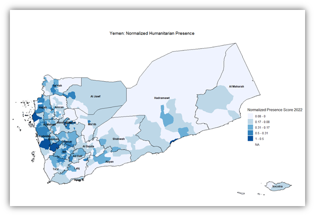
Also, here’s a code for a map that illustrates the presence of NGOs in each district with a normalized score:
# Step 1: Import shapefiles
# Load administrative level 1 (governorate level) shapefile for Yemen
adm1_shapefile_path <- "ye_admin_shapefiles/yem_admbnda_adm1_govyem_cso_20191002.shp"
adm1_shape_data <- st_read(adm1_shapefile_path) # Reading shapefile into R

# Load administrative level 2 (district level) shapefile for Yemen
adm2_shapefile_path <- "ye_admin_shapefiles/yem_admbnda_adm2_govyem_cso_20191002.shp"
adm2_shape_data <- st_read(adm2_shapefile_path) # Reading shapefile into R

# Step 2: Import Excel table
# Load data on population in acute need from an Excel file
excel_path <- "yem_pin_2023.xlsx"
excel_data <- read_excel(excel_path) # Reading Excel file into R

# Step 3: Merge shapefiles with the Excel table and ensure the column is numeric
merged_data <- adm2_shape_data %>%
  left_join(excel_data, by = c("ADM2_PCODE" = "#adm2 +code")) %>%
  mutate(`#presence +normalized +percentage` = as.numeric(as.character(`#presence +normalized +percentage`)))

# Step 4: Reclassify the data based on the normalized presence
n_classes <- 5
class_intervals_normalized <- classIntervals(
  merged_data$`#presence +normalized +percentage`,
  n = n_classes,
  style = "jenks",
  na.rm = TRUE  # Remove NA values for classification
)
color_breaks_normalized <- class_intervals_normalized$brks
merged_data$color_class_normalized <- cut(
  merged_data$`#presence +normalized +percentage`,
  breaks = color_breaks_normalized,
  include.lowest = TRUE,
  labels = FALSE
)

# Step 5: Create the choropleth map using the normalized presence score
ggplot(merged_data) +
  geom_sf(aes(fill = factor(color_class_normalized)), color = NA) + # Color districts based on normalized presence
  geom_sf(data = adm1_shape_data, fill = NA, color = "black", size = 1) + # Outline provinces
  geom_sf_label( # Label governorates
    data = adm1_shape_data, aes(label = ADM1_EN), size = 3, fontface = "bold", color = "black",
    label.padding = unit(0.4, "lines"), label.r = unit(0.15, "lines"), fill = NA, label.size = 0
  ) +
  scale_fill_brewer( # Color scale for normalized presence
    palette = "Blues",
    labels = paste(round(color_breaks_normalized[-1], 2), "-", round(color_breaks_normalized[-length(color_breaks_normalized)], 2))
  ) +
  labs(title = "Yemen: Normalized Humanitarian Presence", fill = "Normalized Presence Score 2022") +
  theme_void() +
  theme(legend.position = c(0.9, 0.45), plot.title = element_text(hjust = 0.5))
Code Block 7: Normalized Humanitarian Presence
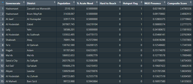
The final result desired in this paper is in the form of a ranked list of districts that takes into account all the previously discussed factors. The code to generate that table is as follows:
# Load necessary libraries
library(sf)         # Handling spatial data
library(readxl)     # Reading Excel files
library(tidyverse)  # Data manipulation
library(ggplot2)    # Plotting
library(classInt)   # Classification of data into intervals
library(ggpattern)  # Adding patterns to plots
library(spdep)      # Spatial dependence: weighting schemes, statistics

# Assign weights to each factor
weight_acute_need = 3     # Positive factor
weight_hard_to_reach = -2 # Negative factor
weight_hotspot = 1        # Positive factor
weight_presence = -1      # Negative factor

# Step 1: Import shapefiles
# Load administrative level 1 (governorate level) shapefile for Yemen
adm1_shapefile_path <- "ye_admin_shapefiles/yem_admbnda_adm1_govyem_cso_20191002.shp"
adm1_shape_data <- st_read(adm1_shapefile_path) # Reading shapefile into R

# Load administrative level 2 (district level) shapefile for Yemen
adm2_shapefile_path <- "ye_admin_shapefiles/yem_admbnda_adm2_govyem_cso_20191002.shp"
adm2_shape_data <- st_read(adm2_shapefile_path) # Reading shapefile into R

# Step 2: Import Excel table
# Load data on population in acute need from an Excel file
excel_path <- "yem_pin_2023.xlsx"
excel_data <- read_excel(excel_path) # Reading Excel file into R

# Step 3: Merge shapefiles with the Excel table
# Joining district level shapefile with Excel data on population in need
merged_data <- adm2_shape_data %>%
  left_join(excel_data, by = c("ADM2_PCODE" = "#adm2 +code"))

# Compute the percentage of population in acute need per district
merged_data <- merged_data %>%
  mutate(percent_in_acute_need = `#inneed +acute` / `#population +total`)

merged_data <- merged_data %>%
  mutate(`#hard_to_reach` = ifelse(`#hard_to_reach`, 1, 0))

# Step 4: Filter out NA values for hotspot analysis
merged_data <- merged_data %>%
  filter(!is.na(percent_in_acute_need))
Code Block 8: Ranked Districts Table – Preparing The Data
# Update the spatial data to match the filtered data
adm2_shape_data_clean <- adm2_shape_data[match(merged_data$ADM2_PCODE, adm2_shape_data$ADM2_PCODE), ]

# Create neighbors and weights for the filtered data
neighbors_clean <- poly2nb(adm2_shape_data_clean)
weights_clean <- nb2listw(neighbors_clean, style = "W", zero.policy = TRUE)

# Calculate Getis-Ord Gi* statistic
gi_star <- localG(merged_data$percent_in_acute_need, weights_clean, zero.policy = TRUE)
merged_data$hotspot_score <- gi_star

# Determine the p-value threshold for significance
p_value_threshold <- 0.05

# Convert the Gi* Z-scores to p-values
merged_data$p_value <- 2 * pnorm(-abs(merged_data$hotspot_score))

# Create a binary flag for statistically significant hotspots
merged_data$is_hotspot <- ifelse(merged_data$p_value < p_value_threshold, 1, 0)

# Proceed with the calculation of the composite score
merged_data <- merged_data %>%
  mutate(
    composite_score =
      (percent_in_acute_need * weight_acute_need) +
      (`#hard_to_reach` * weight_hard_to_reach) +
      (is_hotspot * weight_hotspot) +
      (`#presence +normalized +percentage` * weight_presence)
  )
# Rank districts based on the composite score
merged_data <- merged_data %>%
  arrange(desc(composite_score))

districts_ranking <- merged_data %>%
  select(`#adm1 +name`,
         `#adm2 +name`,
         #`ADM2_PCODE`,
         `#population +total`,
         #`#inneed +acute`,
         percent_in_acute_need,
         `#hard_to_reach`,
         is_hotspot,
         `#presence +normalized +percentage`,
         composite_score) %>%
  rename(
    Governorate = `#adm1 +name`,
    District = `#adm2 +name`,
    #`District Code` = `ADM2_PCODE`,
    Population = `#population +total`,
    #`Acute Need` = `#inneed +acute`,
    `% Acute Need` = percent_in_acute_need,
    `Hard to Reach` = `#hard_to_reach`,
    `Hotspot Flag` = is_hotspot,
    `NGO Presence` = `#presence +normalized +percentage`,
    `Composite Score` = composite_score
  )

# Install the writexl package if it's not already installed
if (!requireNamespace("writexl", quietly = TRUE)) {
  install.packages("writexl")
}

# Load the writexl package
library(writexl)

# Write the districts_ranking dataframe to an Excel file
write_xlsx(districts_ranking, "Districts_Ranking.xlsx")

# Inform the user
cat("The data has been written to 'Districts_Ranking.xlsx'")
Code Block 9: Ranked Districts Table – Creating the Table
Results
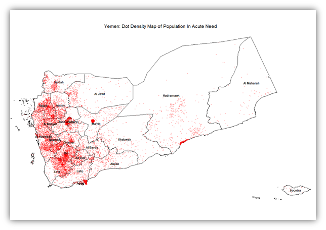
The results of our exercises include maps that show district level need, access limitation, or hotspot intensity of need. However, the ultimate result is producing a priority table that informs decision-makers of what districts to prioritize first. To start off simple, the intensity of people in acute need in relation to area can be shown in a dot density map, where each dot represents 1,000 individuals and is placed randomly within the confines of the district. So 10 dots in a district indicates the presence 10,000 people in acute need within that district.
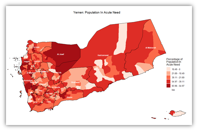
On the other hand, the intensity of people in acute need in a district can be shown in another light, this time in relation to the number of total population. The map shown below is a choropleth map showing the intensity of acute need against the total population for each district.
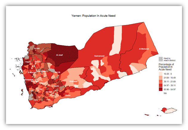
So the intensity of need per district can be inferred from that map. However, there are districts that, regardless of need, we cannot reach, either because it’s logistically, politically, or even bureaucratically difficult to access. The following map adds to the previous one in that it places an additional layer where hard to reach districts are covered with a net-like pattern:
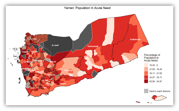
A better approach to show need intensity is to highlight statistically significant values (people in acute need) in districts taking into consideration the way they are distributed spatially. i.e. via performing hotspot analysis. In the below map, hotspot analysis using the Getis-Ord Gi* statistic was employed. This is better than a normal map because it looks at spatial autocorrelation. A p-value threshold of 0.05 was used, which works in most standard cases. And for figuring out neighboring districts, a queen contiguity method was used.
Another important variable to consider when deciding on district priority ranking is the current presence of humanitarian actors i.e. NGOs and INGOs that implement humanitarian projects within the districts. The more presence there is in a district, the less it should be prioritized. The map below shows a normalized presence score. This score has been calculated primarily by summing up the number of NGOs present in each month of 2022, and then normalizing that number down to a percentage of the maximum value. All of this to be able to show how the presence of the humanitarian actors was distributed among districts
Lastly, to generate a table that combines all those aspects/factors/variables into one simple score that describes the total combination of these factors. Code Blocks 8 and 9 describe how this combination is made weighing in the four different factors: Percentage of people in acute need to total population, hotspot districts for people in acute need to total population, hard to reach districts, and current presence of humanitarian actors (NGOs). The first two of these factors are positive, as in they contribute positively to the priority ranking score, and two are negative. The weight associated with each of those factors can easily be adjusted in the code according to how important each factor is. Below is a sample of the resulting district priority ranking table, viewing the first 15 rows:
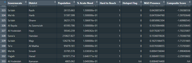
This is another sample of the table viewing the last 10 rows:
Critical Analysis
Observations
Reviewing the sample ranking table reveals that districts with higher needs like Zabid don’t always rank at the top, suggesting the multifaceted approach to scoring works. Moreover, districts marked as hard to reach, such as Maqbanah, don’t seem to be significantly reduced in their scores, suggesting the need for adjusting the impact of accessibility in the composite score.
There seem to be differences in the allocation of hotspot flags across districts with similar degrees of need, which could suggest that the spatial autocorrelation aspect of need in these districts is not as pronounced or that the threshold needs to be revised.
The effect of NGO presence in lowering priority rankings may need careful consideration to ensure that areas with substantial but insufficient aid are not overlooked. All this illustrates the complexities of the need/access nuances across different districts, or perhaps the data/methodology could be improved upon.
Limitations
The question raised by this research requires abundant accurate data, and in the context of a country ravaged by conflict and instability, that might pose quite a challenge. Yemen data sources are either outdated, inaccurate or incomplete which would affect the ability to properly perform hotspot analyses (Anticipation Hub, 2022). The entire analysis exercise depends on the accuracy of data, especially certain variables like people in acute need, which there hasn’t been any documentation on how it’s calculated.
The scoring system, while systematic and data-informed, requires further refinement of weights and definitions to ensure it is truly reflective of on-ground realities for aid distribution. Properly assigning weights for each contributing factor involves a great deal of experimentation, trial and error, and a feedback loop. Another important limitation is the fact that this score ranks the priority to all types of humanitarian interventions. Ideally, there should be a priority ranking for each sector.
Conclusion
The prioritization of humanitarian efforts is a critical exercise as it refocuses the efforts as well as the resources and it ensures that humanitarian aid is delivered to the most deprived.
Since this topic of research is essential in the current situation in Yemen (Daniel et al., 2019), it will be expanded upon in future research, building on it with other types of analysis in addition to the spatial analysis provided here. More aspects and considerations can be factored in the composite ranking score. More data can be included and analysed. Data can also be created where lacking using surveys designed specifically to answer questions raised in the research. Furthermore, as a way of expanding the research analysis, the question of need and reach has to be discussed in terms of each humanitarian sector, affording each sector its own district prioritization index.
References
Anticipation Hub (2022) Information and evidence in Yemen: a case for using predictive analytics and cross-sector collaboration for anticipatory action, Anticipation Hub. Available at: https://www.anticipation-hub.org/news/information-and-evidence-in-yemen (Accessed: 25 December 2023).
Daniel, M. et al. (2019) Tufts – Feinstein International Center – Information and Analysis in Yemen. Available at: http://fic.tufts.edu/publication-item/complexities-of-information-and-analysis-in-humanitarian-emergencies-evidence-in-yemen/ (Accessed: 25 December 2023).
OCHA (2019) Yemen: Hard-to-reach Districts, Humanitarian Data Exchange. Available at: https://data.humdata.org/dataset/yemen-hard-to-reach-districts (Accessed: 22 December 2023).
OCHA (2022a) 'Yemen: Humanitarian Needs Overview'. Humanitarian Data Exchange. Available at: https://data.humdata.org/dataset/yemen-humanitarian-needs-overview (Accessed: 22 December 2023).
OCHA (2022b) Yemen: Humanitarian Needs Overview 2023. Office for the Coordination of Humanitarian Affairs (OCHA). Available at: https://reliefweb.int/report/yemen/yemen-humanitarian-needs-overview-2023-december-2022-enar (Accessed: 20 December 2023).
OCHA (2023a) 'Yemen – Subnational Administrative Boundaries'. data.humdata.org: Humanitarian Data Exchange. Available at: https://data.humdata.org/dataset/cod-ab-yem (Accessed: 20 December 2023).
OCHA (2023b) 'Yemen: Who Does What, Where (3W/4W)'. Humanitarian Data Exchange. Available at: https://data.humdata.org/dataset/yemen-monthly-organizations-presence-3w (Accessed: 24 December 2023).
Save The Children (2023) Humanitarian aid in Yemen slashed by over 60% in five years, Save the Children International. Available at: https://www.savethechildren.net/news/humanitarian-aid-yemen-slashed-over-60-five-years (Accessed: 20 December 2023).